New Shoes
Today is a special day in the studio, because after months of work, we’ve just put our brand new website live. Check it out!
I thought I’d cover some of the key aspects of the site and why we made the choices that we made, to give you all a bit of insight into how this sort of project gets put together.
Look and feel
We were pretty clear what we wanted to achieve with this: a truly unique look and feel. It sounds incredibly cliché for an agency to say that, but it’s very important to stand out because — again, cliché — we’re not like other agencies.
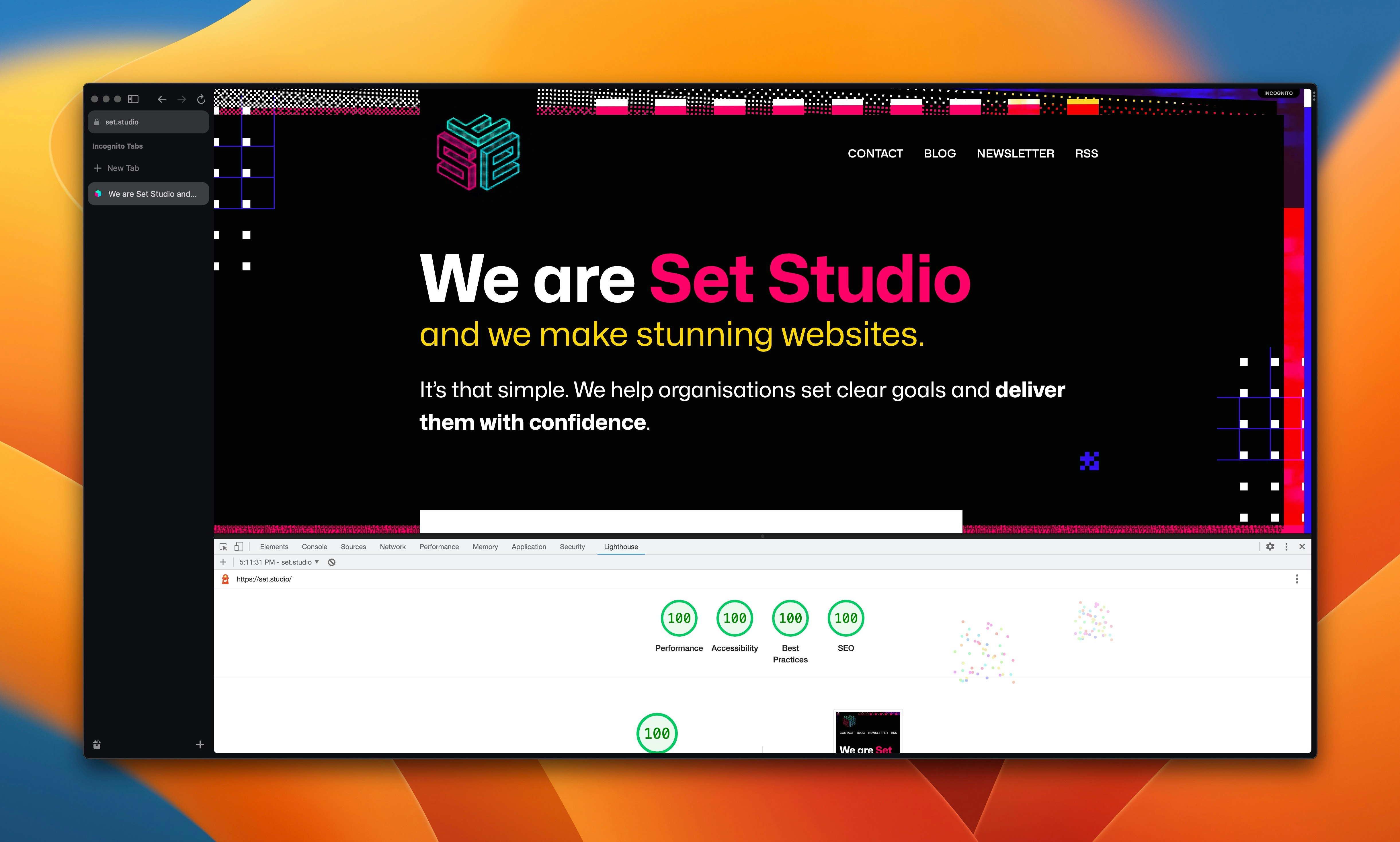
The core message that we wanted to get across is that we turn messy ideas into solid strategies, so the idea that we have a glitchy, messy start, which gets progressively neater as you scroll really stuck for us and we really leaned into it.
It made for quite an interesting front-end development conundrum in places, but with some expert slicing and strategy by Leanne, it got done, perfectly well.
We also had to keep an eye on performance too, but because Leanne got the textures superbly optimised, we’re comfortably getting 100’s across the board in lighthouse. You certainly can achieve creative flair and performance if you really put the effort in.
Displaying portfolio work
One of our most important offerings is that we produce truly responsive design by building up from solid foundations, letting the browser do the hard work, with workable rules and providing fluidity with fluid typography and spacing.
It’s really hard to demonstrate this with pictures of websites, which you’d normally see on an agency site. A picture of a site doesn’t give you — excuse the pun — the full picture.
I’ve had this obsession for a while now of using good ol’ <iframe> elements that can be resized with an <input type="range" />, so we ran with it for this site. In earlier versions of the site, we also had pictures of projects dotted around, but once you see the real project, right there on the page, those pictures started looking really out of place.
There were some technical considerations though:
- Users on small devices wouldn’t get the full benefit of a resizable frame, so we removed the controls for them. Really, they get the best experience because we actually design smallest-up, rather than just saying we do, so removing the controls makes sense.
- Because
<iframe>elements are scrollable, they present a usability issue. As a user scrolls the site, an<iframe>could catch that intent and hijack it — especially on touch devices. This is why you have to “activate” the frame, or just interact with it to enable scrolling. - Loading several websites in another site is a potential performance hot potato. Luckily, just like with images,
<iframe>elements support theloading="lazy"attribute. This means that the framed content only loads as it gets near the visible viewport area
All in all, they’re working really well, so I’m glad we persisted with this approach. There were definitely doubts along the way, but I’m really glad the work we’ve tirelessly produced for clients is getting the best possible showcase.
Tech stack
I know folks like to know how sites are built, so let’s break it down. First though, let me set the stage of our intention. Our core priority is access and inclusion. The best way to achieve this is with a solid foundation of semantic HTML, CSS and progressive enhancement via newer web platform features and JavaScript.
If we had chosen a JavaScript-based framework to build our website, we would fail the core priority of inclusion because that puts a lot of users at risk of getting a poor experience, so this approach wasn’t even considered. It’s a brochure site after all: it doesn’t need to be heavily loaded with JavaScript, not less, completely powered by it.
What we needed was something that made content management easy for our blog and newsletter while also giving us complete control over HTML markup and front-end assets like images and CSS. WordPress was the obvious choice here. We knew it would knock it out of the park because we’ve got well over a couple of decades of combined experience with it in the Studio. There’s a more detailed run-down of the WordPress setup here too.
For CSS, we of course, went with CUBE CSS as our methodology. We used Every Layout layouts for our layout compositions and Tailwind CSS as a utility class generator. We like this setup in the studio. Everything has it’s job and does it well and that’s certainly the case on our new site.
For JavaScript stuff, we just wrote good ol’ vanilla JavaScript. One nice little addition though, is the like button on articles. This uses Petite Vue, which is a tiny little version of Vue JS. Because that component is highly state-driven, it warranted Vue. Check out this tutorial by Andrew Walpole if you want to integrate something similar.
With thanks
I want to close out this article by thanking the extremely talented people that put this site together.
First up, a huge thank you to Amy Hupe who was in charge of content design. She’s an incredible content designer and did an incredible job of distilling our core message.
Another big thank you goes to Leanne who took charge of design engineering. It’s because of them that the creative look and feel looks as good as it does in the browser. They expertly got this thing looking real nice.
Finally, a massive thank you to James who was the mastermind behind the look and feel of the site. They took the scattered ideas from my brain and produced absolutely stunning design work.
We hope you’re enjoying the new site and have enjoyed this break down. We’re really thankful to everyone who has said very nice things across social media. It means the world to us!