Reality Check #2: Building out a fancy 404 page from Layers
Ok, I promised a more complex example on the last edition of Reality Check, and here we go. The trick here though is it looks complex, but we’re gonna lean into the power of CSS to make it pretty darn easy.
This edition’s project permalink
I’ve selected 404 Error Page (Mobile) by Davi Pribadi on Layers. You might look at this and think, that it’s tricky. It certainly can be tricky, but we’re gonna make it easy and you’re gonna learn some CSS tricks.
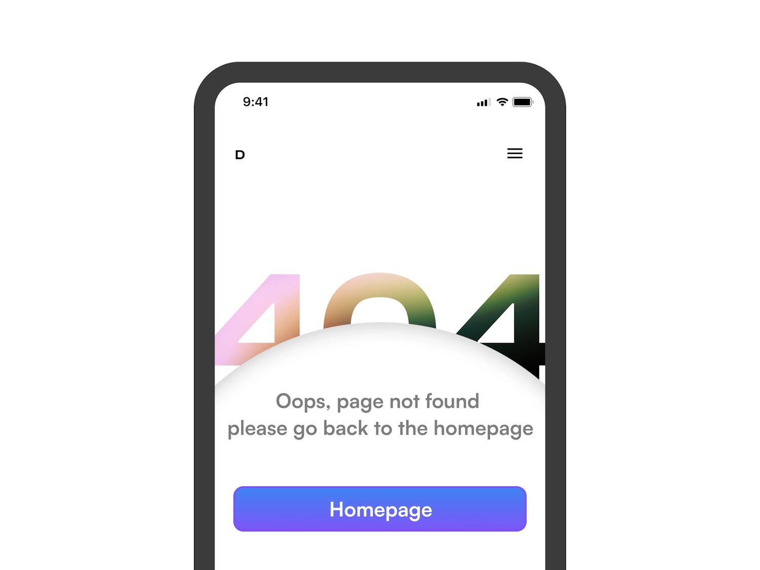
I’m, as usual, going to make some design alterations though. I’m not a huge fan of the colours, the content, or the inner shadow, so I’ve updated those. The overall principle of that bleed-out heading that’s got a gradient, and set behind the curved content container remains though, because this is where the tricks will be learned.
HTML first, always permalink
Here’s everything inside the <body> element. HTML-wise, it’s really straightforward.
- Code language
- html
<main>
  <h1 class="mega-heading">404</h1>
  <div class="curved-container">
    <div class="curved-container__content flow">
      <p>We’re sorry but the page you’re looking for can’t be found.</p>
      <a class="button" href="/">Go back to homepage</a>
    </div>
  </div>
</main>
You might be wondering why there’s an extra <div>: the .curved-container__content element. It’ll make sense later, I promise. The takeaway here is we want to keep the HTML as simple and semantic as possible, which is what we’ve got.
Global CSS permalink
Just like the previous edition, we’re going to be building with the CUBE CSS principles. That starts with styling as much as you can, globally.
It makes sense to start with the global variables that give us some nice consistency. The main part of those variables is the fluid type and fluid space scale, using Utopia.
Fluid type and fluid space allow us to create truly responsive designs that respond to the viewport, rather than forcing rigid, catch-all sizes. We’d definitely recommend that you read up on the Utopia site.
- Code language
- css
:root {
  --font-base: Inter, Segoe UI, Roboto, Helvetica Neue, Arial, sans-serif;
  --font-display: 'Rubik Mono One', monospace;
  --color-dark: #363950;
  --color-light: #ffffff;
  --color-light-shade: #f3f3f3;
  --color-primary: #b25d66;
  --gradient-primary: linear-gradient(111deg, #002846 0%, #ff7373 82.7%, #ffaf7b 97.2%);
  --gradient-secondary: linear-gradient(180deg, #a25863 0%, #373950 100%);
  --size-step-0: clamp(1rem, 0.9592rem + 0.2041vw, 1.125rem);
  --size-step-1: clamp(1.2rem, 1.1022rem + 0.4888vw, 1.4994rem);
  --size-step-2: clamp(1.44rem, 1.2576rem + 0.9122vw, 1.9988rem);
  --size-step-3: clamp(1.7281rem, 1.4224rem + 1.5286vw, 2.6644rem);
  --size-step-4: clamp(2.0738rem, 1.5911rem + 2.4133vw, 3.5519rem);
  --size-step-5: clamp(2.4881rem, 1.7545rem + 3.6684vw, 4.735rem);
  --size-mega: 45vw;
  --space-s: clamp(1rem, 0.9592rem + 0.2041vw, 1.125rem);
  --space-m: clamp(1.5rem, 1.4388rem + 0.3061vw, 1.6875rem);
  --space-l: clamp(2rem, 1.9184rem + 0.4082vw, 2.25rem);
  --space-xl: clamp(3rem, 2.8776rem + 0.6122vw, 3.375rem);
  --gutter: var(--space-m);
}
The tricky part of this article though, is although global styles would be extremely useful in the wider context of the website this 404 page lives in, I don’t want to make this article longer than it needs to be. Still, let’s just have a look at the baseline styles, which build on top of this CSS reset.
- Code language
- css
body {
  font-family: var(--font-base);
  font-size: var(--size-step-0);
  background: var(--color-light-shade);
  color: var(--color-dark);
  overflow-x: hidden;
}

h1 {
  font-size: var(--size-step-5);
}

h2 {
  font-size: var(--size-step-4);
}

h3 {
  font-size: var(--size-step-3);
}

:is(h1, h2, h3) {
  max-width: 30ch;
}

:focus {
  outline-offset: 4px;
  outline-color: var(--focus-color, var(--color-dark));
}

p {
  max-width: 60ch;
}

a {
  color: currentColor;
}

::selection {
  background: var(--color-dark);
  color: var(--color-light);
}
It’s mainly global typography settings to make prose content read nicely. Even though this stuff doesn’t feature much on our build, it’s useful to add in.
The one part I do want to draw your attention to though is the overflow-x: hidden rule on the body. Because our “404” heading bleeds out of the edges of our viewport, we need to conceal that. It won’t affect anything for the user, but if we wanted to use position: sticky, we’ll have problems, so I thought I’d pre-warn you.
Compositions (layout) permalink
We’ve only got one composition in this build, the flow utility, which adds space to the top of sibling elements.
- Code language
- css
.flow > * + * {
  margin-top: var(--flow-space, 1em);
}
You’ll spot that it is already on our .curved-container__content element and if you’re interested in how it works, check out this article.
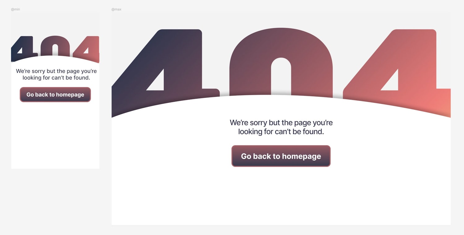
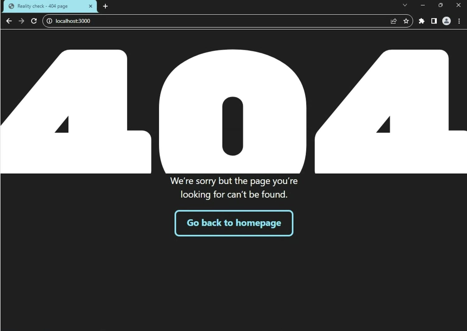
Let’s check in how it looks:
Only global CSS and layouts are in, but it’s taking shape.
Blocks (components) permalink
Let’s start with the most interesting block: that big ol’ “404” heading. We’ve got an accurately named class of mega-heading on it, so let’s apply some styles:
- Code language
- css
.mega-heading {
  width: calc(100vw + 0.2ch);
  font-family: var(--font-display);
  letter-spacing: -0.1ch;
  font-size: var(--size-mega);
  line-height: 1;
  margin-inline-start: 50%;
  transform: translateX(-50%);
  color: transparent;
  background-color: var(--color-dark);
  background-image: var(--gradient-primary);
  background-clip: text;
  -webkit-background-clip: text;
}
Big ol’ block of CSS right? Fear not, let’s break it down:
- We want the heading to be more than full bleed, so using
calc, it’s100%plus0.2the width of a0character (achunit) in the font’s rendered size. The text is massive, so that equates to a decent bleed out. - Still using a
chunit, we compress the letters a bit withletter-spacing. - Even though we’re using a mono font and therefore can better predict font sizing, I’m sorry to say that
45vwis a magic number (but at least we made it a variable). It’s just one of those things you gotta do by eye I’m afraid. The saving grace is in this instance we know that our heading is going to be “404”, so we have a modicum of control. If this was to be more of a shared component, I’d recommend looking into the “fit text” pattern, along with somewhite-spacetreatment. - We completely center align the heading with a combination of
50%margin and-50%transform. This centers the element even when it’s as wide as, or wider than the viewport.
Adding the gradient
The gradient part needs a bit more explanation, so let’s break out of the breakdown.
First up, we’re using --gradient-primary from our global variables, but setting it as the background. This is because we’re going to use the text as a mask with background-clip: text, which uses the shape of the text to clip the background image / colour.
The only way this gradient or colour is going to show up is if we make the text transparent in colour with color: transparent. Don’t panic though, because it renders all good in high contrast mode.
Adding the curved container block
This is the part of the page that contains the short paragraph and button. There’s a nice curve on the top too.
You’ll also notice that this content appears to sit above the “404” and might rightly be thinking “damn this is gonna be complicated”.
One thing I can’t stress enough is that CSS stuff only gets complicated if you make it complicated. CSS is outrageously powerful if you learn how it works at the core. Let me teach you some of that now.
Firstly, the curve. We could over-complicate this by utilising clip-path, but why bother? Let’s add a nice, simple SVG element to our HTML, which now looks like this.
- Code language
- html
<main>
  <h1 class="mega-heading">404</h1>
  <div class="curved-container">
    <svg
      xmlns="http://www.w3.org/2000/svg"
      fill="none"
      viewBox="0 0 1440 105"
      preserveAspectRatio="none"
      aria-hidden="true"
      focusable="false"
    >
      <path d="M1440 97.315C716.52-78.932 182.417 23.879 0 97.315V105h1440v-7.685Z" />
    </svg>
    <div class="curved-container__content flow">
      <p>We’re sorry but the page you’re looking for can’t be found.</p>
      <a class="button" href="#">Go back to homepage</a>
    </div>
  </div>
</main>
A couple of bits to note about this SVG element:
- We’ve got a
preserveAspectRatio="none"attribute on there because we want this thing to “squish” into shape later. - We’ve got
aria-hidden="true"andfocusable="false"on there because it’s purely decorative, so we don’t want assistive tech to accidentally interact with it.
Now, let’s add some CSS:
- Code language
- css
.curved-container {
  font-family: var(--font-display);
  font-size: var(--size-mega);
  background: var(--color-light);
  position: relative;
  margin-block-start: -0.45ex;
}
Now, you might be thinking “what the hell are you doing setting such massive text?”. It’s a good question! Remember how we want to do things as simple as possible right? The simplest way to position everything is to know exactly how big the text we’re covering up is. Now we’ve got that in place, we can use relative units in a predictable manner, knowing they are explicitly related to the text we’re partially concealing.
In fact, the first place we use that is positioning this container over part of the text. Because the container’s font size is the same as the “404” heading’s, we can use an ex unit — the height of the x character — to add negative margin to our curved container.
- Code language
- css
.curved-container svg {
  font: inherit;
  fill: var(--color-light);
  display: block;
  width: 100%;
  height: 0.2ex;
  position: absolute;
  bottom: calc(100% - 1px);
  filter: drop-shadow(0px -10px 18px rgb(0 0 0 / 25%));
  z-index: 0;
}
Again, keeping things super simple, we’re using font: inherit here to keep the font trickery going. This time, we’re using an ex unit to set the height of the curve. This will now always be relative to the height of the heading that it partially conceals. Handy, right?
In terms of positioning, we’re going all in with position: absolute because we don’t want this curve to be part of the curved container’s rendered size. Using bottom, we’re positioning the bottom edge of the <svg> to the top of the curved container, by setting the value to 100%.
Unfortunately, thanks to the new IE — AKA mobile Safari, which is forced on all iOS users — we have to calc a pixel off that value, or a hairline crack will appear…
Another point I want to touch on here is the use of the drop shadow filter. The reason we use that instead of box-shadow is because drop shadow will follow the shape of the <path>, whereas box-shadow does exactly what it says on the tin: applies shadow to the box.
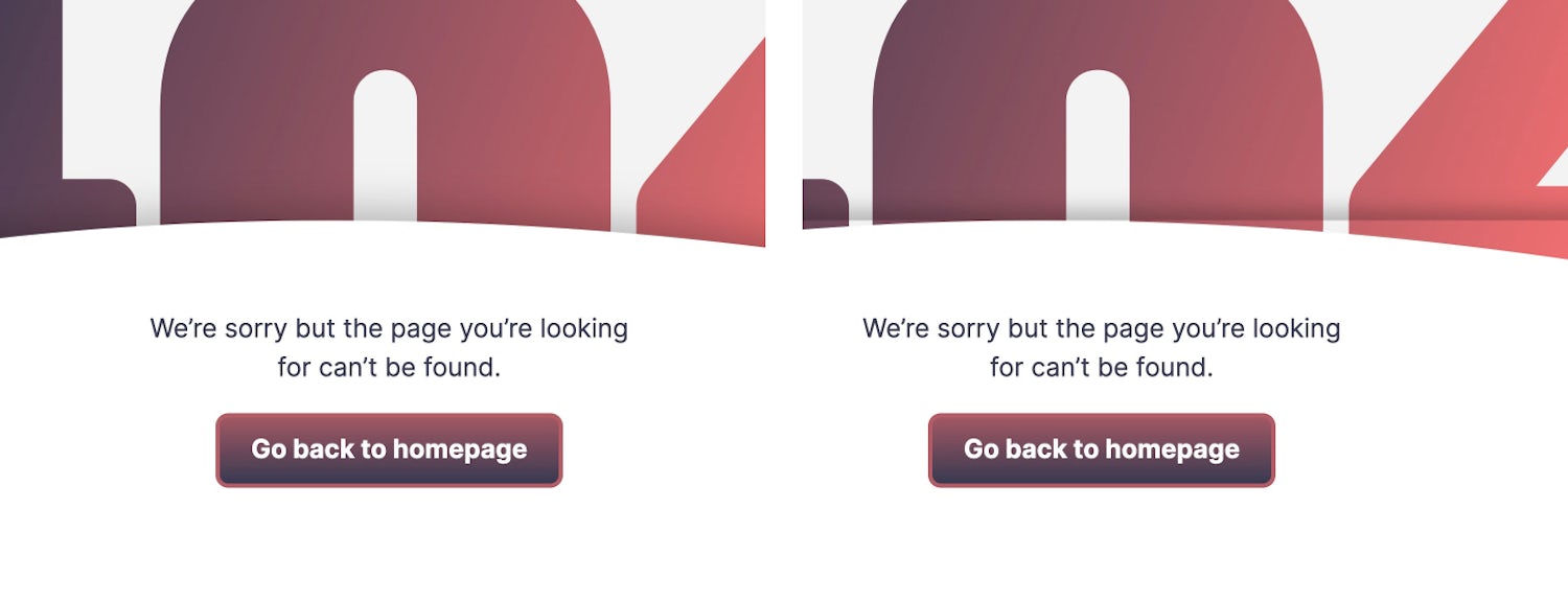
Drop shadow on the left and box shadow on the right
One thing we absolutely do need to consider is high contrast users. Luckily, there’s a media query we can use.
- Code language
- css
@media (prefers-contrast: more) {
  .curved-container svg {
    display: none;
  }
}
All we’re doing here is determining if a user prefers high contrast and if they do, we hide the curve itself, so it doesn’t interfere with the text. This is because the fill value of the svg will still be honoured, even in high contrast mode, so it’s best to just remove the element, visually.
Right, let’s style up the content in this container.
- Code language
- css
.curved-container__content {
  font-family: var(--font-base);
  font-size: var(--size-step-1);
  text-align: center;
  padding-block: var(--space-m);
  position: relative;
  z-index: 1;
  background: var(--color-light);
}
Remember how we set the text to be massive to assist with positioning? Well, we need to reset that here to make sure text doesn’t actually render massive.
The background application means we can hide the drop shadow spillage from our curve and setting z-index: 1, we’re making sure our content layer always sits above the actual curve. This is also why we added that extra <div> earlier.
Let’s add the last couple of bits for our curved container:
- Code language
- css
.curved-container__content > * {
  max-width: 30ch;
  margin-inline: auto;
}

@media (min-width: 800px) {
  .curved-container__content {
    padding-block-start: 0;
  }
}
The first part reduces the width of the content by its own character width, then pushes it into the center of the container with margin-inline: auto. We already have text-align set on the curved-container__content so don’t need to set that again. Without margin-inline: auto, the text would be center-aligned, but not horizontally centered, thanks to the max width. Now we have both.
The last part is a little visual tweak. This is where I see media queries being the most useful, rather than being used for layout changes (where you can help it of course).
All we’re doing is removing the top padding where space allows. This is because thanks to the massive text, the size of the curve will be big enough to give the illusion of padding. The curve isn’t big enough to do that on smaller viewports.
Making the curved container fill available space
We’ve got a problem. Because our content is short, the background and even part of the “404” heading can show up under our content. Let’s fix it with the power of flexbox.
First up, we need to adding the following to our body:
- Code language
- css
body {
  /* All the other CSS */
  display: flex;
  flex-direction: column;
}
Next, add this rule for the <main>:
- Code language
- css
main {
  display: flex;
  flex-direction: column;
  flex: auto;
}
This makes the <main> stretch to fill the available space in the body (thanks to flex: auto) and will then allow a child element to do the same.
Lastly, we add this to the curved container:
- Code language
- css
.curved-container {
  /* The rest of the CSS */
  flex: auto;
}
The curved container will now fill any available space left in the <main> element. Flexbox is the best.
Adding the button component
All the really hairy stuff is done! All we’ve got left to do is make our button look lovely.
- Code language
- css
.button {
  display: inline-block;
  padding: 0.7em 1.2em 0.85em 1.2em;
  background: var(--color-dark);
  background-image: var(--gradient-secondary);
  color: var(--color-light);
  font-weight: 700;
  text-decoration: none;
  border-radius: 0.5em;
  line-height: 1;
  border: 4px solid var(--color-primary);
}
It’s a bit different to the original on Layers, but I wanted the colours to match the heading better.
Next, some interactive states:
- Code language
- css
.button:hover {
  background-size: 150% 150%;
}

.button:active {
  transform: scale(99%);
}
Firstly, we’re making the gradient bigger on hover, so it appears to get lighter 😎. You could set a different gradient on hover, but meh, why bother when you can tweak the gradient’s canvas size? Always be keeping things simple, friends.
Lastly, this is one of my favourite tricks in CSS. Ideally, you want a button to interact to being pressed, so one way to do that is make it appear to be squidgy. Using transform: scale(99%) does exactly that!
Wrapping up permalink
I think the key takeaway from this edition of Reality Check is even if a design looks like it’s gonna be tricky, spend plenty of time planning and thinking not “how am I going to code this?”, but instead “what is CSS already giving me to make this work?”.
The power CSS gave us in this build is relative units, which when you think slightly out of the box with them, are unbelievably powerful and allow you to truly express yourself in design.