Reality Check #1: Building out a furniture site from Dribbble
Welcome to Reality Check, a new blog series where I take some work from Dribbble or Layers, then refactor the design into something that will work really well on the web.
After that, I go ahead and build it — breaking down the steps — to show you how to build in an efficient, truly responsive and progressively enhanced manner. It’ll give you a look behind the curtain at how we do things in the studio.
Why am I doing this? permalink
So often, work on Dribbble and Layers is visually stunning, but how it will actually work in the browser hasn’t been considered. This isn’t just exclusive to Dribbble and Layers too because designers handing off static Figma files to developers seems good in theory, but often, developers will be stuffing codebases full of magic numbers and hacks to get a “pixel perfect” output in the browser.
The problem with this approach is you have no idea what context your users will be visiting your site in and being the browser’s mentor, not it’s micromanager is a guaranteed way to build truly responsive front-ends that work for everyone. We’ll show you how to do that in each edition of this series.
This edition’s project permalink
I’ve chosen Furniture e-commerce website by Hrvoje Kraljevic. It’s a fairly straightforward one to start with, but it’s even simpler when you approach it flexibly.
Original Dribbble shot by Hrvoje Kraljevic
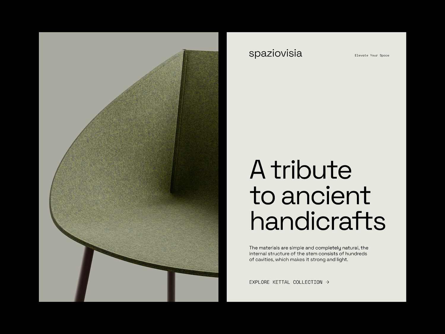
As you can see, it’s a 50/50 split layout that also has a vertical split on the right-hand side content section. The problem is, this only has a desktop design. The first thing we’re going to do is mock-up a similar version in Figma, including a minimum width viewport.
Our Figma comp tackles the smallest and largest viewports. I’ve also change the type scale and reduced padding in places.
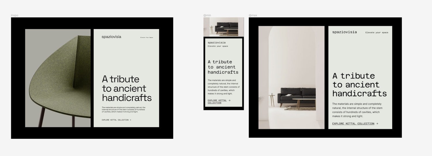
This doesn’t look exactly the same — mainly because I don’t know what fonts were used, and I don’t have access to the image asset. I’ve also levelled things out a little bit so we can use fluid type and space and also free Google Fonts, in case you wanted to give this a go yourself. The main change I wanted to make was that the typography should follow a type scale, to improve the overall rhythm.
Still, it’s pretty darn close, so let’s get cracking with the build!
HTML first, always permalink
It’s important to get the foundation of our build in the best place possible with semantic HTML. Using semantic HTML has so many benefits, but some key ones:
- If nothing but the HTML arrives, the content will make complete sense to the user because the browser has its own user agent styles
- Screen readers and other assistive tech will have a much easier time describing content to users
- It benefits SEO
- Users who use tools such as Reader Mode on Safari, will have a much better experience
In short: if you mark up the page using only <div> elements, you might be making your life easier (although I’ve never subscribed to that logic), but you will be making the experience of your users much, much worse.
Here’s all the HTML of the page, within the <body>:
- Code language
- html
<main class="switcher wrapper">
  <picture class="decorative-image">
    <source
      srcset="images/graphic-shallow.jpg 1x, images/graphic-shallow-2x.jpg 2x"
      media="(max-width: 600px)"
    />
    <source srcset="images/graphic.jpg 1x, images/graphic-2x.jpg 2x" />
    <img src="images/graphic-shallow.jpg" alt="" loading="lazy" />
  </picture>
  <div class="content repel" data-repel-variant="vertical">
    <header class="site-head repel">
      <p class="site-head__name">spaziovisia</p>
      <p>Elevate your space</p>
    </header>
    <article class="flow">
      <h1>A tribute to ancient handicrafts</h1>
      <p>
        The materials are simple and completely natural, the internal structure of the
        stem consists of hundreds of cavities, which makes it strong and light.
      </p>
      <p>
        <a class="icon-link" href="#">
          <span>Explore Kettal collection</span>
          <svg aria-hidden="true" focusable="false" xmlns="http://www.w3.org/2000/svg" fill="none" viewBox="0 0 24 25" height="1.5ex" width="auto">
            <g>
              <path
                fill="currentColor"
                d="m16.172 11.5-5.364-5.364 1.414-1.414L20 12.5l-7.778 7.778-1.414-1.414 5.364-5.364H4v-2h12.172Z"
              />
            </g>
          </svg>
        </a>
      </p>
    </article>
  </div>
</main>
Let’s pick out some key areas.
- We’re using
<div>elements, but they are dividing the content to make CSS layout easier. - The semantic
<main>,<header>and<article>elements structure the content, along with using a<h1>for the page’s only heading. - The
<picture>element allows us to render either a shallow image for smaller viewports, or a deeper image for larger viewports. It also allows us to provide low-resolution and higher-resolution versions of the image so lower resolution devices don’t need to waste bandwidth. - The
<img>inside of the<picture>has an emptyaltattribute. This is because the image is decorative, so it can safely be hidden from screen readers. You must provide an emptyalt, rather than noaltif you want to do that. - The
<svg>is also hidden from screen readers witharia-hidden="true". This is again, because it’s decorative and provides no real value unless you can see it.
Styling it up permalink
Before we start, I just want to note that we will be using the CUBE CSS principles to build out this front-end.
The first thing to do is pick out as much of the UI style as we can as global styles. As it says in the CUBE documentation:
With CUBE CSS, we embrace the cascade and inheritance to style as much as possible at a high level. This means that when nothing but your global styles make it to the browser, the page will still look great. It’s progressive enhancement in action and enables us to write as little CSS as possible.
Along with this global CSS, we will create some global variables that give us some nice consistency too. The main part of those variables is the fluid type and fluid space scale, using Utopia.
Fluid type and fluid space allow us to create truly responsive designs that respond to the viewport, rather than forcing rigid, catch-all sizes. We’d definitely recommend that you read up on the Utopia site.
- Code language
- css
:root {
  --font-base: Inter, Segoe UI, Roboto, Helvetica Neue, Arial, sans-serif;
  --font-display: 'Azeret Mono', monospace;
  --color-dark: #000000;
  --color-light: #e5e8df;
  --size-step-0: clamp(1rem, 0.9661rem + 0.1695vw, 1.125rem);
  --size-step-1: clamp(1.125rem, 1.0243rem + 0.5034vw, 1.4963rem);
  --size-step-2: clamp(1.2656rem, 1.0692rem + 0.9822vw, 1.99rem);
  --size-step-3: clamp(1.4238rem, 1.0921rem + 1.6585vw, 2.6469rem);
  --size-step-4: clamp(1.6019rem, 1.0817rem + 2.6008vw, 3.52rem);
  --size-step-5: clamp(1.8019rem, 1.0209rem + 3.9051vw, 4.6819rem);
  --space-2xs: clamp(0.5rem, 0.4831rem + 0.0847vw, 0.5625rem);
  --space-xs: clamp(0.75rem, 0.7161rem + 0.1695vw, 0.875rem);
  --space-s: clamp(1rem, 0.9661rem + 0.1695vw, 1.125rem);
  --space-m: clamp(1.5rem, 1.4492rem + 0.2542vw, 1.6875rem);
  --space-l: clamp(2rem, 1.9322rem + 0.339vw, 2.25rem);
  --space-xl: clamp(3rem, 2.8983rem + 0.5085vw, 3.375rem);
  --space-m-xl: clamp(1.5rem, 0.9915rem + 2.5424vw, 3.375rem);
  --space-mega: clamp(6rem, 4.5763rem + 7.1186vw, 11.25rem);
  --gutter: var(--space-s);
}
You might be thinking “holy heck, that’s a lot” and yeh, fair point, but fluid type and space scales basically power your entire UI and simplify decision making, so a block of variables seems like a darn good trade-off — especially for a full website project.
These variables are really handy because if you need larger text than what you’ve currently got for an element: go one (or many) up in the size scale and it’ll be perfectly in ratio — maintaining the flow and rhythm of your page. The same applies to spacing too.
With these variables in place, we’re in a position to start writing some global styles.
- Code language
- css
body {
  font-family: var(--font-base);
  font-size: var(--size-step-0);
  background: var(--color-dark);
  color: var(--color-light);
  padding-block: var(--gutter);
}

:is(h1, h2, h3) {
  font-family: var(--font-display);
  font-weight: 400;
  word-spacing: -0.3ch;
  max-width: 30ch;
}

h1 {
  font-size: var(--size-step-5);
}

h2 {
  font-size: var(--size-step-4);
}

h3 {
  font-size: var(--size-step-3);
}

p {
  max-width: 60ch;
}

a {
  color: currentColor;
}

svg:not([width]):not([height]) {
  height: 1.5ex;
  width: auto;
}

main {
  --switcher-vertical-alignment: stretch;
}

::selection {
  background: var(--color-light);
  color: var(--color-dark);
}
There’s not a huge amount here because it’s a very simple UI. Also, we only have one section, of one page, so it’s tricky to build out a whole suite of global styles.
Still, it’s important to start global because the aim is to write as little CSS as possible. Even in this part of the build, we’re saving time and bytes by using this reset.
Most of that CSS is pretty self-explanatory, but the key parts are:
- Setting the initial step of the type size scale as the
bodyfont size means that anyemunit will by proxy, be fluid, even if we don’t apply any of the other type size scale steps. - The negative word spacing for headings is because our display font is a monospace font. This means that all characters are the same width, including spaces. This is fine for smaller text, but it gets real grim for larger text.
- For
<svg>elements that don’t have a width and height, we want to prevent blow-outs, so setting a default size, based on the x-height of it’s parent is a great set and forget thing. - The
<main>element is setting a--switcher-vertical-alignment. We’ll come on to that later… - We set the opposite colours for text and background when text is selected, to provide contrast.
Let’s check in how our project looks so far. Activate the preview to scroll.
Time to get on some layout permalink
With global CSS in place, the next step is to move on to the C of CUBE CSS: Composition. From the documentation:
The composition layer’s job is to create flexible, component-agnostic layout systems that support as many variants of content as possible.
What this means is that our layout does only layout and nothing else. This prevents the need for authors to add layout that will affect sibling elements in their components, which in turn, results in extremely resilient pages.
The Switcher
This is one of the many layouts on Every Layout and in short, it allows content to sit inline (next to each other) as long as a configurable container width is available.
- Code language
- css
.switcher {
  display: flex;
  flex-wrap: wrap;
  gap: var(--gutter, var(--space-s));
  align-items: var(--switcher-vertical-alignment, flex-start);
}

.switcher > * {
  flex-grow: 1;
  flex-basis: calc((var(--switcher-target-container-width, 40rem) - 100%) * 999);
}
Now what this doesn’t do is make the columns exactly 50% wide: we’re letting the browser take over here to let the content size the elements because we just don’t need that strict control.
The aim of the component and it’s weird looking flex-basis calculation is for a 50/50 split, or more accurately, an equal distribution of space where available. The mathematics is explained in the Every Layout chapter.
That’s our split layout sorted, so let’s move on to the next layout.
Repel
This does exactly what it says on the tin: items repel from each other like polar-opposites, where space allows.
- Code language
- css
.repel {
  display: flex;
  flex-wrap: wrap;
  justify-content: space-between;
  align-items: var(--repel-alignment, center);
  gap: var(--gutter, var(--space-s-m));
}

.repel[data-repel-variant='vertical'] {
  --repel-alignment: stretch;
  flex-direction: column;
}
This is what powers the top part of the content panel and the vertical split between header and content, thanks to the [data-repel-variant="vertical"] CUBE CSS Exception.
It doesn’t matter what the content is of Repel child elements, because if their content prevents there being enough room to actually repel: the layout stacks nicely. Proper responsive design!
Flow
This is my favourite 3 lines of CSS.
- Code language
- css
.flow > * + * {
  margin-top: var(--flow-space, 1em);
}
In short, it creates a configurable, but relative space between sibling elements. To keep this article as short as possible, I’ll encourage you to go ahead and read the explainer.
What I definitely will note, though, is we use this in every project.
Wrapper
This one is pretty self-explanatory. It’s a central wrapper with a max-width.
- Code language
- css
.wrapper {
  max-width: 1300px;
  margin-inline: auto;
  padding-inline: var(--gutter);
}
In this case, we’re using pixels, but you could use whatever relative unit is appropriate in your project’s context.
Again, let’s check in to see how things look.
Blocks (components) permalink
Now the global CSS and the compositional layouts are done, it’s time to do the colouring in.
In CUBE CSS, a Block is just like a component. Where we didn’t want to apply visuals to layouts, we do in blocks. We’re also going against the grain of the global styles.
At this point, you’ll likely find that blocks are mostly extremely light, because we’ve done so much already.
Content block
This is the right-hand (in left-to-right language) panel of content.
- Code language
- css
.content {
  --gutter: var(--space-mega) 0;

  background: var(--color-light);
  color: var(--color-dark);
  padding: var(--space-m-xl);
  font-size: var(--size-step-1);
}

.content h1 {
  max-width: 11ch;
}

.content p {
  text-wrap: balance;
}

.content h1 + p {
  --flow-space: var(--space-l);
}
The first bit to cover is --space-mega. This is a custom spacing pair in Utopia, between 3xl and 7xl. This space grows and shrinks based on the viewport, which means we get responsive spacing.
Even though we’re using Repel to vertically split content — which in turn, uses --gutter to control gap — we still want to make sure there’s always space, even when the split layout is stacked.
The main thing I want to highlight here is setting a max width of 11ch on the heading. This is the length of the longest word — “handicrafts”.
Because we’re using a monospace font, every character is the same width, so we can comfortably set that limit to shape our heading nicely. Without a monospace font, your ch unit will be the width of a 0 character.
Lastly, notice how we are setting a ::selection style because the colours are reversed in the panel. We want to make sure that text selection is visible.
Site head
This is the repelled header, at the top of the content panel.
- Code language
- css
.site-head {
  --repel-alignment: baseline;
  --gutter: var(--space-2xs) var(--space-m);
  font-size: var(--size-step-0);
}

.site-head__name {
  font-size: var(--size-step-2);
  font-family: var(--font-display);
  line-height: 1.1;
}
Notice how we’re configuring the Repel composition here? Because the two element’s text sizes are different, along with different fonts, setting a baseline alignment keeps things looking nice and neat.
Icon link
This is the little link with an icon.
- Code language
- css
.icon-link {
  display: inline-flex;
  align-items: baseline;
  gap: 0 var(--space-xs);
}

.icon-link svg {
  transform: translateY(0.2ex);
}

.icon-link:hover {
  text-underline-offset: 0.2ex;
}
Using inline-flex allows the element to size itself based on content. Otherwise it would be block-like and try to fill available space.
We’re again, aligning to the baseline instead of center because if this link was multi-line, it would look real weird with a center-aligned icon. The transform: translateY(0.2ex) is an optical adjustment to account for that alignment choice, pulling the icon into the center of the first line of text.
Decorative image
This is our last block! Let’s first see the code:
- Code language
- css
.decorative-image {
  container-type: inline-size;
}

.decorative-image img {
  width: 100%;
  height: 100%;
  object-fit: cover;
}

@container (min-width: 70vw) {
  .decorative-image img {
    max-width: unset;
    width: 100vw;
    height: unset;
    margin-inline-start: 50%;
    transform: translateX(-50%);
    aspect-ratio: 10/5;
  }
}
Oh hello, it’s container query time! What we are doing here is determining if the container — which is our <picture> element — is 70vw wide or larger. If that’s the case, our Switcher layout has stacked, which means we can safely presume that our image now occupies 100% of the available width.
When that is the case, we change the aspect ratio to be shallower and make the image “full bleed”, by forcing it to be 100vw wide, then positioning in the center, using this trick.
Instead of using a media query to determine this state, or a px/em/rem value, we are letting the browser do its job, then responding to that state change. Pulling everything together like this is a super resilient way of doing things.
Wrapping up permalink
First of all, let’s take a look at the final result. You can use the resizer to size the frame.
I hope this has shown you by simplifying a UI at the core, you can build something that’s visually pleasing, while not negatively affecting the end-user’s experience.
I’ll definitely pick a more complex item from Dribbble or Layers for the next edition of Reality Check too. I just wanted to warm us all up with this first post of the series 😉