An iterative process to our agency website design
Even though we’ve got a combined experience of over 30 years here, Set Studio is a really new agency. It was founded in 2021.
The main reason I founded the Studio is that I – Andy – wanted to to build on the work I’d already done as a freelance designer and consultant. Since the vast majority of my experience in the industry was in client services, an agency felt like the natural progression to that.
There was a lot of work to be done, though. A name needed to be thought up, branding needed to be developed and – the most terrifying prospect for an agency – we had to design our own website.
Start small
We wanted to practice what we preach with our clients. A big part of what we do is research and discovery at the start of a project. We break down all the information we get from the client, work out what the problems to solve are, then develop a strategy together.
The deliverable for this research and discovery project is a brief. Sure, a client might produce a brief before they start working with us, but what often happens in the research and discovery project is problems that would have tripped us up in production get exposed with prototyping. The overall solution to the problem gets thoroughly challenged with those prototypes, along with research and testing.
The idea is that the brief that gets produced could inform any production team to produce stunning work. In fact, some clients hire us to just do the research and discovery project with a view to producing in house.
The bit we needed to do ourselves on this internal web design project, was embrace iteration. We encourage this from day 1 with clients, because perfection doesn’t happen overnight, but over time.

I have this art mounted on my office wall and I always send it to new clients. It’s so simple, yet so effectively demonstrates the creative process. This is how we like to produce projects in the studio, because it works and the end result is always better when you produce in iterations, rather than a big bang project.
The plan for our site
We knew we wanted to build iteratively, but we also knew the messaging that we wanted to communicate. We got to work, solidify our messaging and content, right off the bat. This would give us a solid foundation to build on.
We knew spending months producing our own site, so early in the agency’s existence, would be daft because we knew things would change and evolve over time.
We knew what wouldn’t change: our outlook and messaging, but we knew the branding and client showcases would evolve. We were also workshopping what the offering of the studio was, so didn’t want to commit that to our site yet.
But, we did have a domain name and wanted to get something up, so a very quick and dirty landing page was born.
The quick and dirty landing page
We had a studio name and a domain name and that was about it.
I wanted to start using my agency email address (andy@set.studio) straight away though, so we needed something online.
I had this idea that the agency was in some sort of loading state still, so I popped open CodePen and made this version.
It’s super simple and just links people to our Twitter account. It wasn’t much, but if someone interacted with us on email and were curious about the domain, they’d at least see something.
We managed to get a bit of creative flair in there with the CRT monitor effect and cursor animation, but in terms of a basic lander, we were off to a flyer and ready for the next iteration.
Branding and the start of what you see today
Now we had a starting point, we could focus on branding the studio and creating the all important logo. We’ll probably go into more detail of that process in a later post, but what it did do is give us colours, typography and overall theme to work with.
It was time to pop the initial landing page in the bin and launch a more up to date version, with some light copywriting work. We went with light copy because we were still working on our overall offering and didn’t feel the need to have to completely commit to it yet. Check out that version here
We still wanted to add some flair though, so introduced a nice trick with variable fonts and mouse hovers. We also introduced some subtle animation when the page loaded too.
Again, this wasn’t much, but it reflected us: an agency that was itself developing and iterating. This version of the site was endlessly more iterable than the initial landing page we launched, too.
The site stayed looking like this for quite a while and served its purpose. It still brought in enquiries and was zero maintenance, which allowed us to navigate through a very busy period of client work. Check that version out here
Later down the line, when we had our final cut of the website copy, we wanted to introduce some of it. We’d also produced a project that educated people about how we build sites; letting the browser do the hard work and building everything on a solid foundation of progressive enhancement and inclusivity.
It was just a little iteration that was completely inline with our agency’s iteration process too. Check that version out here.
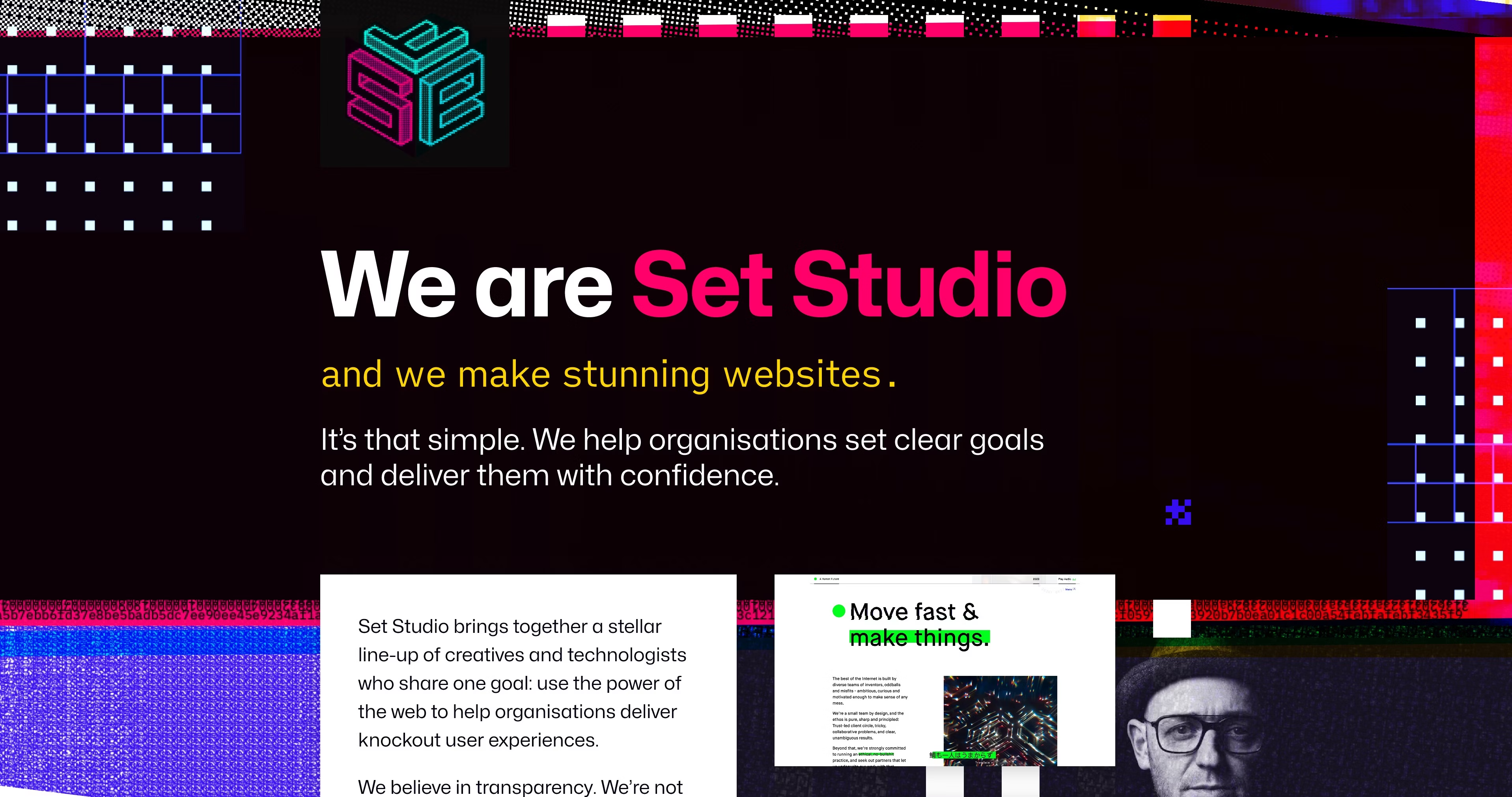
Finally, the version of the site you see today (well, at the time of writing). As you can see, we introduced a lot more copy and also re-worked the typography. We also added a blog and newsletter, so we could start publishing more frequent content.
Again, this was another small iteration that refined the project overall. That iteration was born from creative work we were doing on the next iteration of the site, which will feature all of the content that we’ve spent all this time working on.
Speaking of which…
The future “final” state
I’ve put “final” in quotes, because we all know, there’s very rarely a final state.
Even when you look back at Brendan’s art: the final circle is still a little bit messy. I personally love that, because a lot of web projects are never truly finished. They’re always iterated over time, getting more and more refined in each iteration.
If you were to position us on the art, we are currently between the 3rd and 4th sketchy circle. That’s because we’ve been working really hard on a look and feel. Here’s a quick taster:
As you can see it’s quite a step up from where we are now and will require quite a sizeable chunk of production work to get it live.
The thing is, because we’ve iterated and shipped small, we have had the breathing space to get properly creative in the meantime. We could have done the Big Bang design job from the start, but it would have slowed the business down too much.
And that’s the message of this whole article, really: If you iterate and keep things simple, you get space to refine and enhance a solid foundation.