Move fast. (without breaking things)
Why work with us
Invest smart and strategically
We cut through the noise and calculate what will make an impact for you. Our primary focus is efficiency and minimising waste with our sprint-based, low risk, iterative process. There’s no long-winded moonshots here, just a tangible return on investment that a traditional agency couldn’t dream of delivering.
Adapt or get left behind
We won’t let you chase and mimic your competitors because you’ll be too busy blowing them out of the water. Market leaders adapt as a competitive edge and that’s exactly where we’ll position you, without compromising on quality.
Trust us to deliver the goods
We take complete control of projects because we know it’s not your day-to-day focus. We become an extension of your team, bringing decades of experience close to where it matters to help you race past your competitors.
Selected partner success stories
Transformed a respected tech blog to an ambitious, profitable publisher
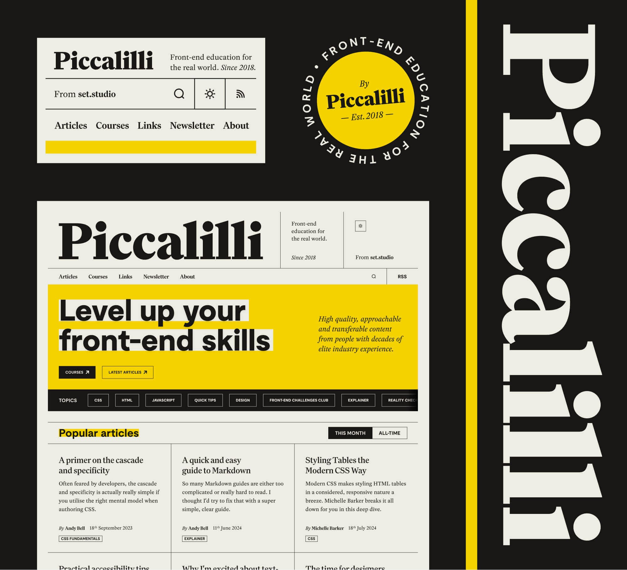
Piccalilli brand strategy, UI design, visual identity, design system Helped grow a 6 figure a year revenue business to an 8 figure a year business
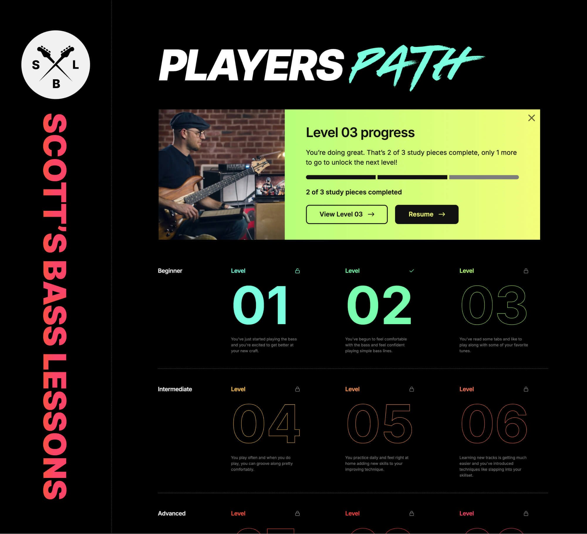
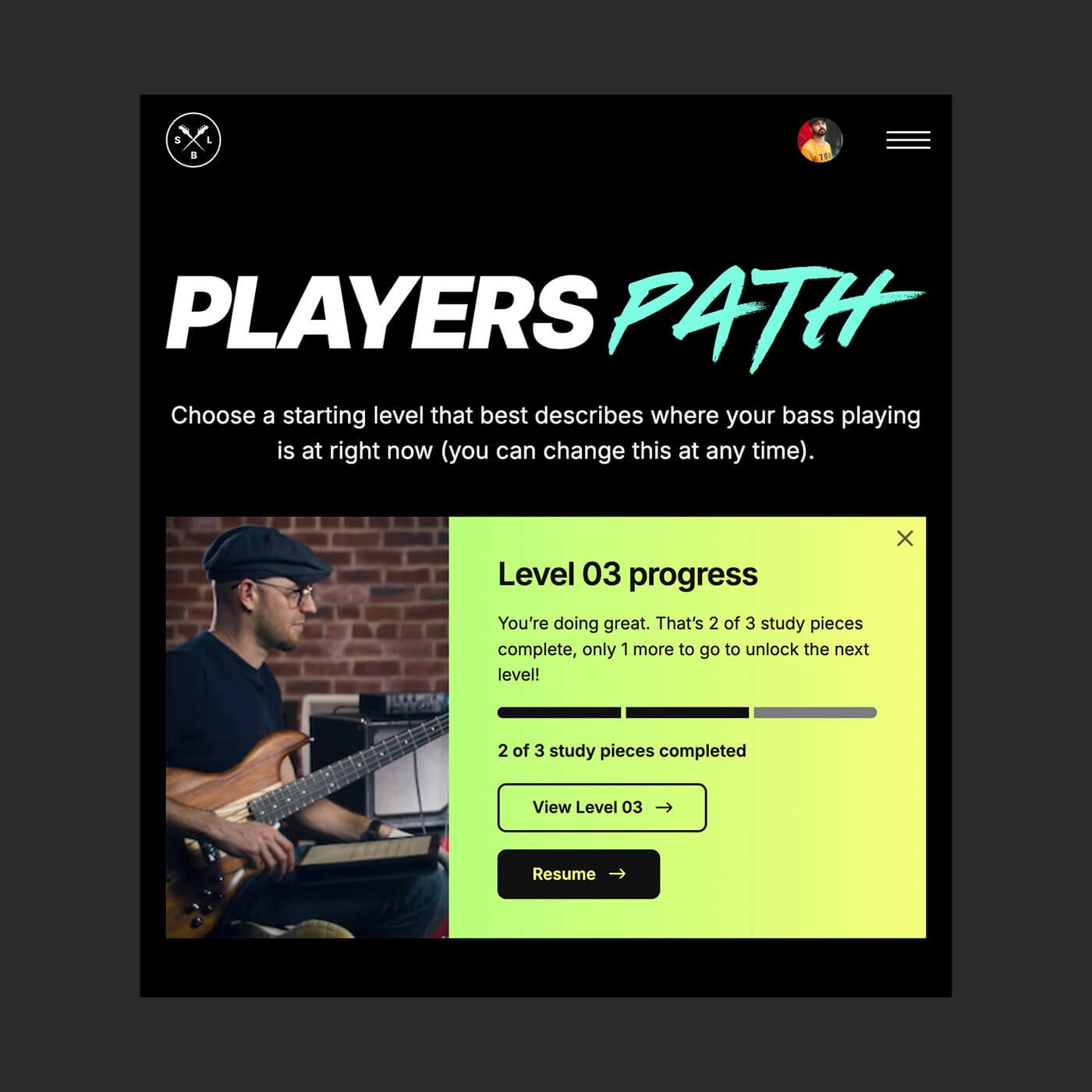
Scott’s Bass Lessons UI design, design system, conversion optimisation Delivered a design system that enabled developers to design without creative support
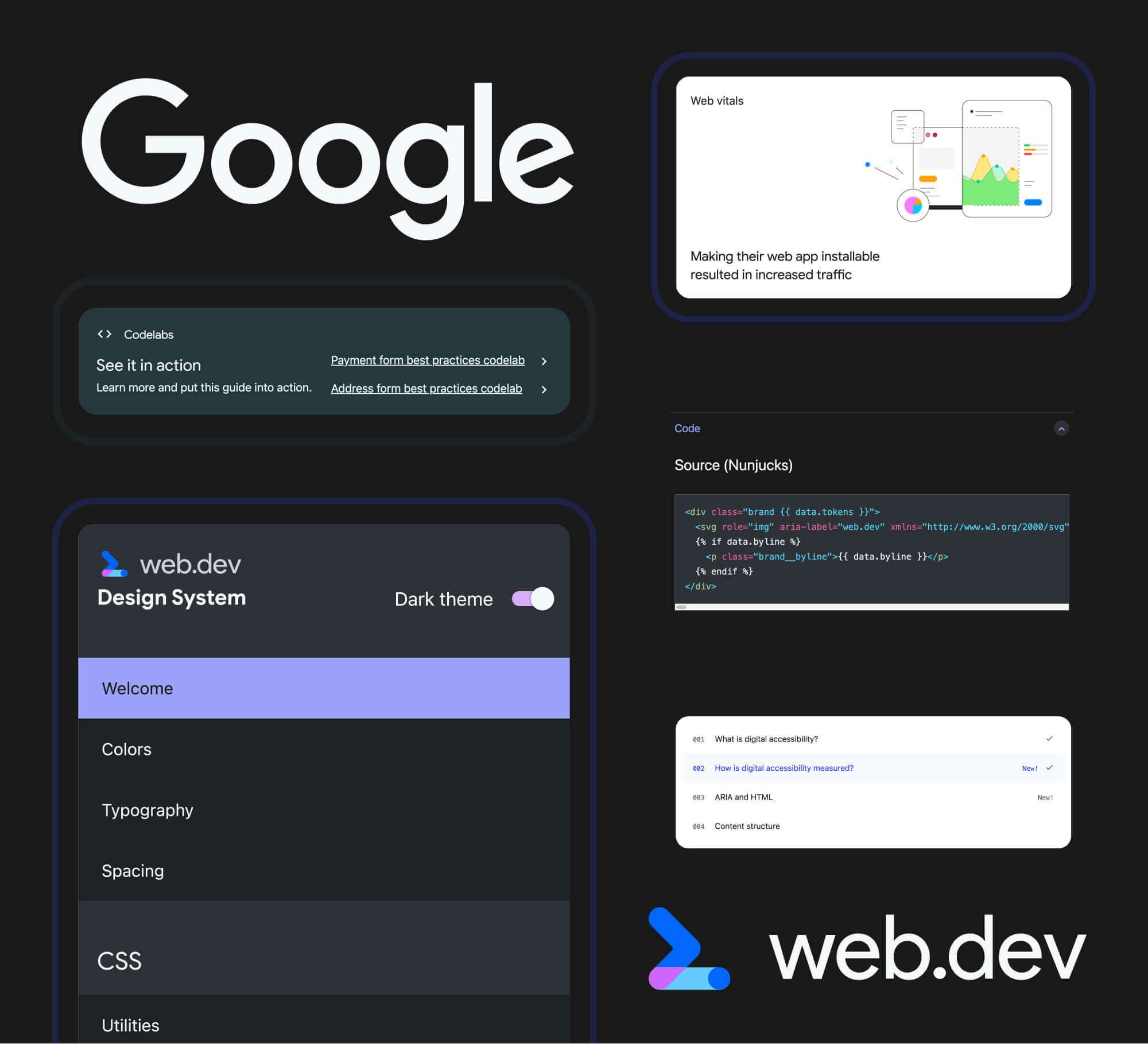
Google Design system, platform roll-out Reduced cost per conversions by over 70% with a focused, themeable system
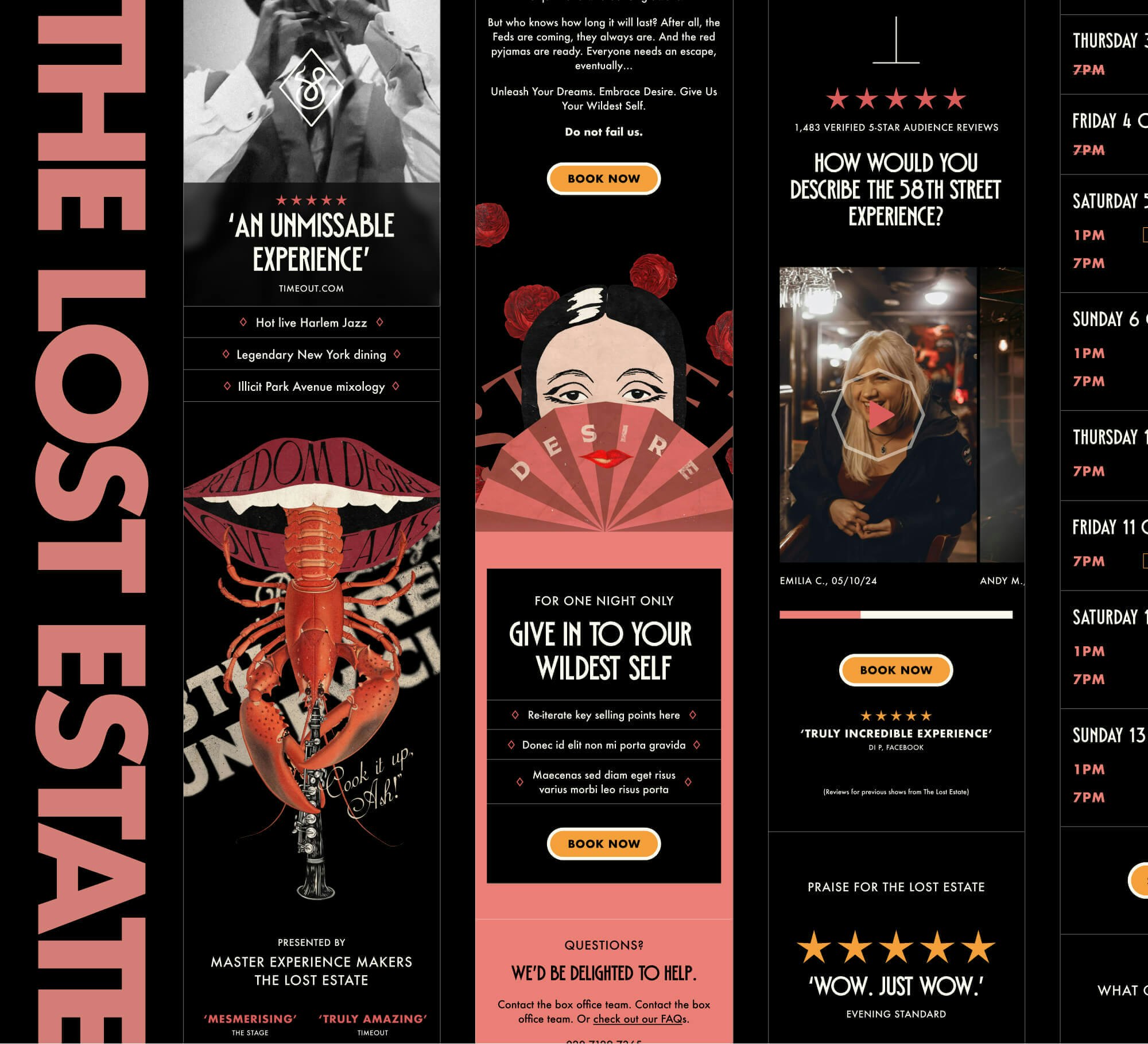
The Lost Estate Highly themeable system, conversion optimisation, brand refinement Enabled a legendary designer to take back control of their font sales, increasing profits
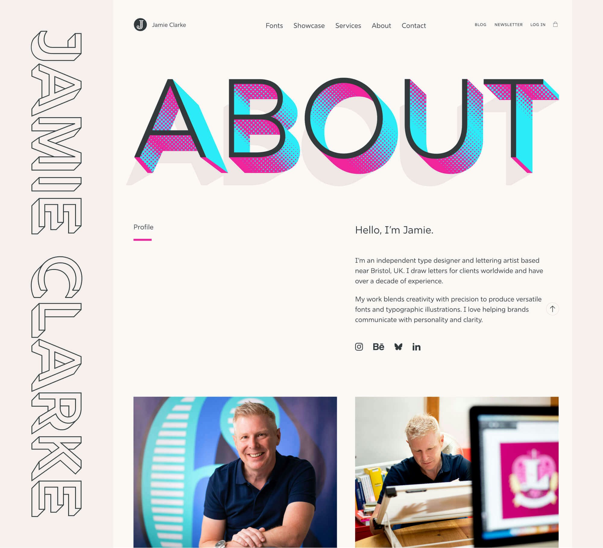
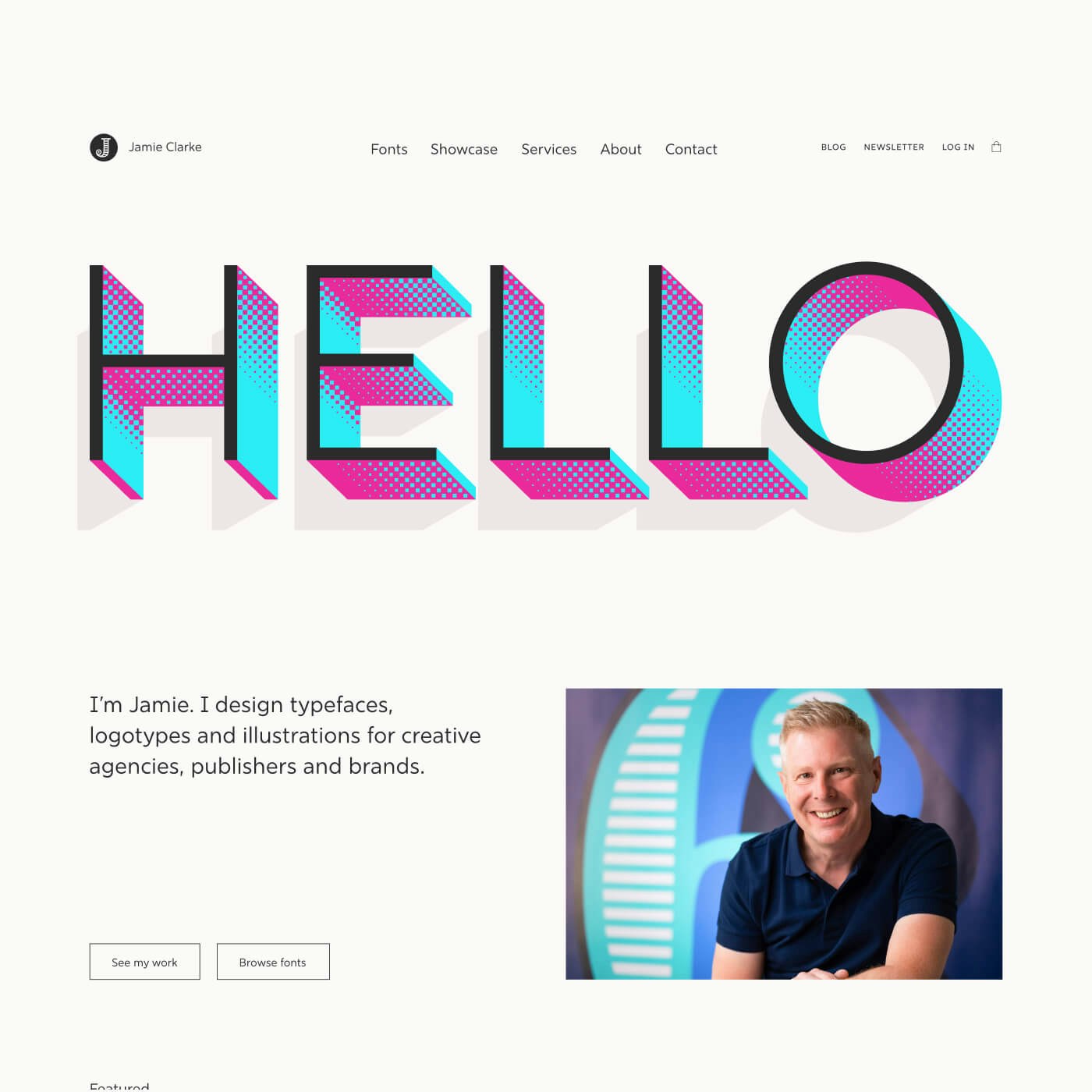
Jamie Clarke Type UI design, front-end development Developed a design language and marketing overhaul to achieve a 7x increase in paid members
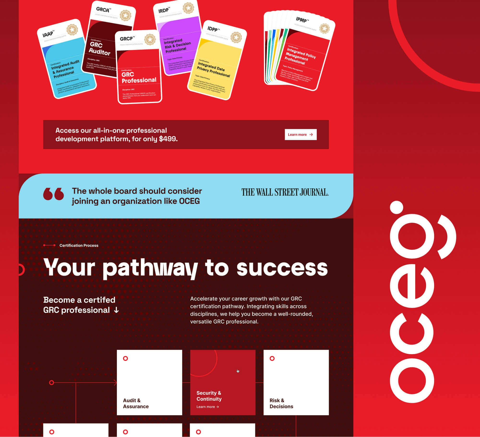
OCEG Design system, marketing site redesign, asset creation, UX optimisation Produced a complete refocus from respected finance blog to trusted investment partners
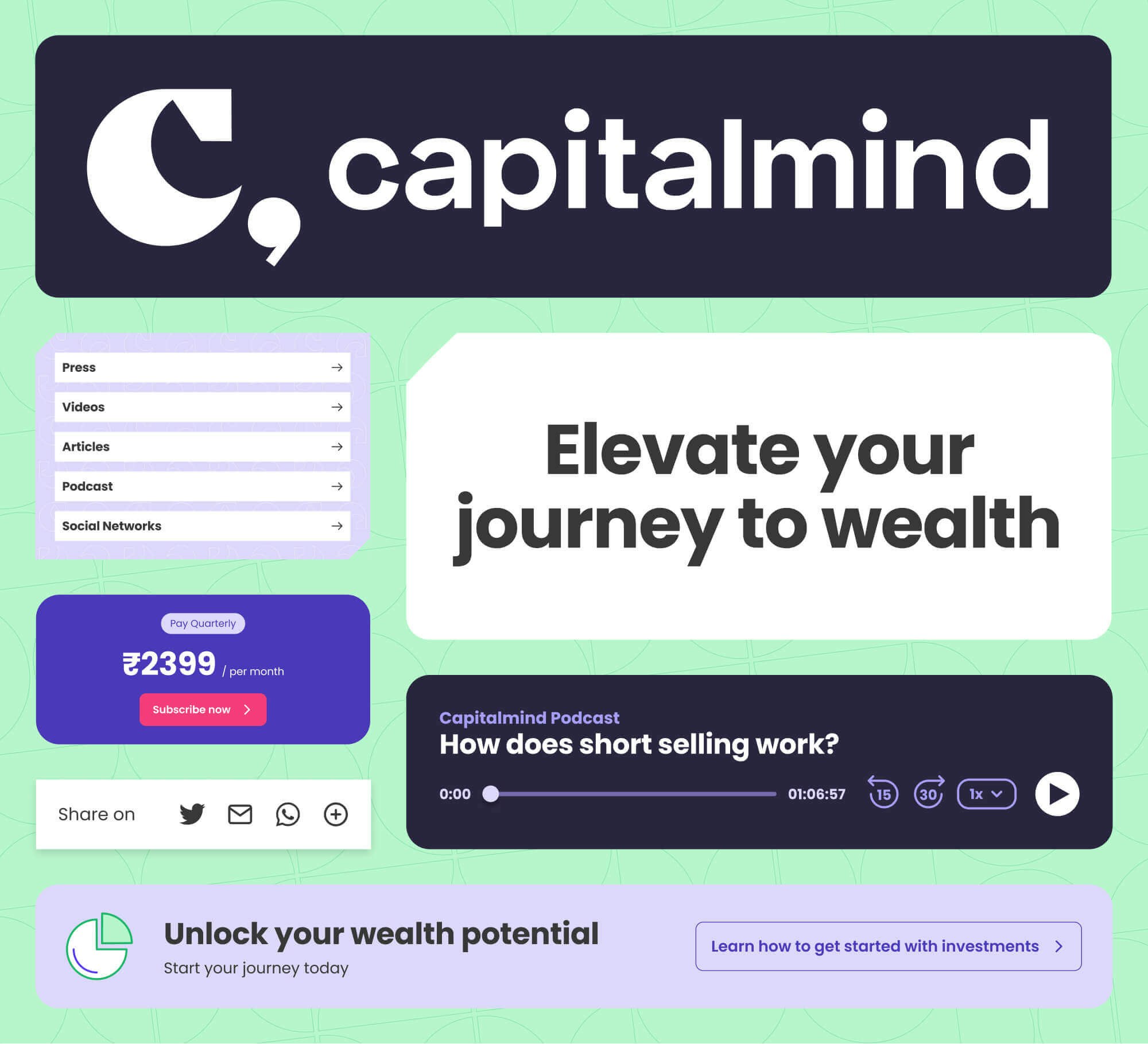
Capitalmind UI design, consultancy Refined a leading agency’s brand to enable solid growth and more profitable engagements
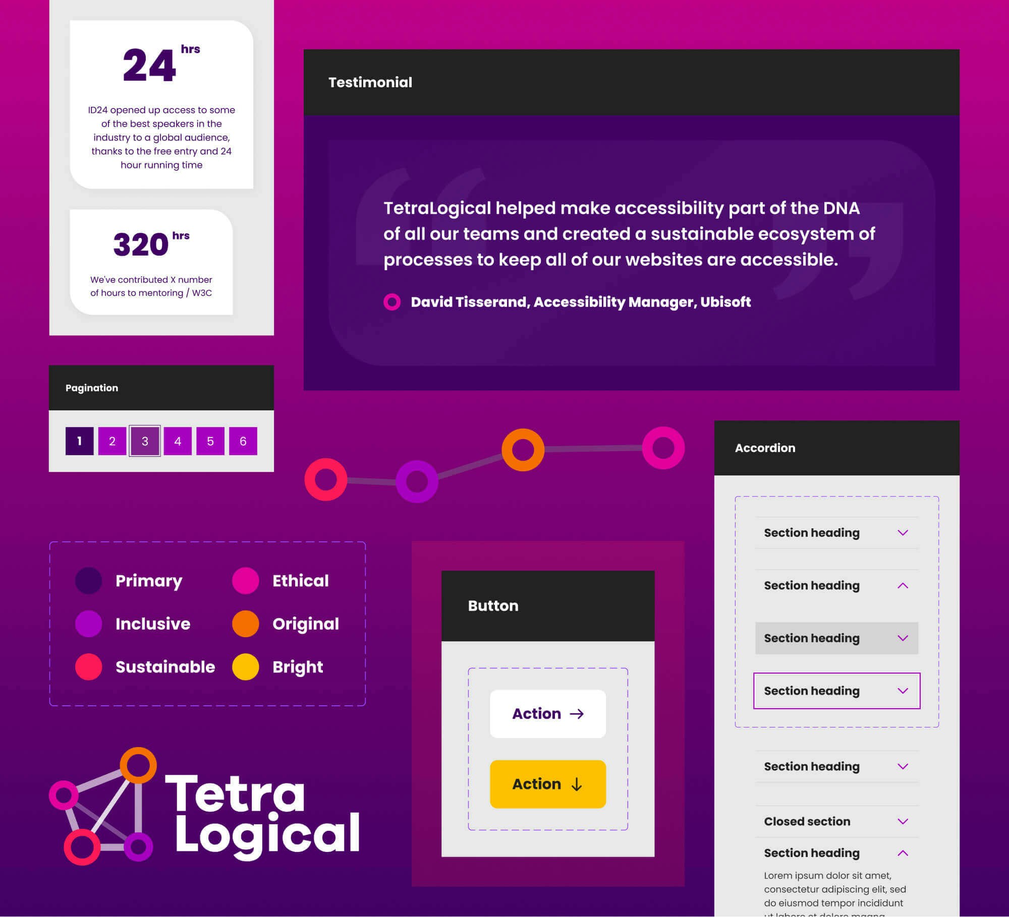
TetraLogical UI Design, WCAG AAA compliant front-end development
Studio
We’re small, but we pack a punch.
Set Studio is a UK-based, tight-knit group of creatives, strategists and technologists with plenty of bite that adapt to excel, no matter what we’re faced with, thanks to our iterative approach to design partnership.
You get honesty, pragmatism and a team that want nothing more than to deliver excellence at all points, who will swim against the tide to get there. With a combined industry experience at the highest level of over 50 years, you couldn’t be in better hands.

Andy Bell
Founder
Ruthlessly pragmatic strategist and educator

Leanne Renard
Tech Lead
Systems obsessed, web standards specialist

Jason Bradberry
Design Lead
Mind-blowingly creative, typography aficionado

Vicky Morris
Producer
Chief organiser and friendly client partner
The Network
Trusted, talented and verified independents that fit like a glove in the studio
What we do
Design
- Branding
- User experience design
- Conversion optimisation
- Design systems
- Design that makes your eyes smile
Technology
- Inclusive, high performing user interfaces that work for everyone
- Flexible layout systems
- Web standards that work anywhere
- Front-end architecture
- User interfaces that adapt to any situation
Strategy
- Roadmaps
- Campaigns
- Content design
- Design and code reviews
- Consultation and education
Experience
Over 50 years of combined, elite level experience
Over 50 years of combined, elite level experience
We’ve been there and seen it all
In their long, successful careers, our team have worked with some of the largest, well-known brands and organisations. They’ve also helped smaller organisations and startups explode in growth — completely transforming them from root to branch.
Partner feedback
We started working with Set on a small design system for our resource centre. This allowed us to rapidly iterate and eventually expand to a whole-site redesign with their help. We've built up a really good, ongoing relationship with Set because of the success of this iterative approach, and continue to further improve OCEG with them as our design strategy partners.
I have identified your superpower. Your ability to strike a balance between giving us what we wanted and not including elements that you believed wouldn’t add value to our brand was truly commendable.
Working with Set has revolutionised our approach to launching our digital brands. Their solutions have enabled us to deploy new websites faster than ever before, completely transforming our paid digital testing processes. Thanks to Set, we're empowered to test, iterate, and refine rapidly, all without needing external developers. They’re more than just a design and development team; they’re essential partners in our digital growth.
I worked with Set on a creative technology build that really set out to do something bold and ambitious from a design perspective. The Set team delivered a result I was thrilled with – outstanding quality to time and budget and a frictionless workflow. Unreservedly recommend Set and already looking forward to working together again.
web.dev wouldn't be what it is today without Set’s direction. The major redesign, with the new design and component systems they shipped have set our team up for the future.
Set Studio have been fantastic. They’ve created a world-class website while helping me refine how I present my business to clients and customers. Their expertise navigating the challenges of my e-commerce platform has been invaluable. I couldn’t be happier with the outcome.
For our website redesign, Set Studio was the only choice. Their deep understanding of inclusive design ensured accessibility was seamlessly integrated into bold, vibrant visuals and animations. With a content-first, iterative approach, they kept everything on track, making the entire process a delight.
Approach
| Set Studio | Traditional Agency |
|---|---|
Full studio focus on your project | A small subset of the team working on your project, along with multiple other projects |
Senior level staff working on your project | Less senior and junior members working on your project |
Fair pricing with lower overheads | Lots of expensive overheads, resulting in inflated prices |
We take complete charge, allowing you to do your day job in peace | Frequent requests for sign-off, approval, meetings and content |
Direct contact with recognised experts in design and technology | Access to an account manager who relays information between client and agency |
Iterative, efficient process | Long-winded traditional waterfall process |
Pricing
We’re honest about our efficient pricing. It’s based on two week sprints, priced the same for everyone. Every sprint ends with a playback and review to make sure we’re all on track to deliver on time and on budget.
£15,000 per sprint
Excluding VAT and sales tax, where applicable
Typical project budgets
Instead of responding to “how much is a website?” with “how long is a piece of string?”, we’re transparent about typical budgets. Every case is different, but here’s some ballpark starting prices to give you an idea of whether we fit your budget plans.
- Brand strategy: starting at £90,000
- Brand design: starting at £60,000
- Website design: starting at £90,000
- Design systems: starting at £135,000
- Landing pages: starting at £45,000
- Consultation and training: starting at £15,000
Get in touch
Ready, set, go
We already know we’re going to be the right fit for you, so reach out and let us prove it. Let’s get to work blowing your competition out of the water.
Prefer to email? Drop us a line at enquiries@set.studio.
